For years, Irish interiors have leaned heavily on safe neutrals.
White kitchens. Grey bathrooms. Pale tiled floors.
And while minimalism has its place, something is shifting.
Architects and self-builders across Ireland are beginning to introduce controlled, earthy colour — not bold statements, but tone. Depth. Warmth.
The move isn’t towards louder interiors.
It’s towards more considered ones.
There’s a reason white and grey became dominant.
They’re safe.
They reflect light.
They feel clean and modern.
But when every surface is white or cool grey, interiors can start to feel flat — especially in Irish light, which is softer and often overcast.
Colour doesn’t need to be dramatic to transform a space.
Sometimes it just needs to be warmer.
Across contemporary builds we’re seeing:
Soft mineral beiges replacing brilliant white
Muted greens grounding kitchen spaces
Warmer greys replacing cold concrete tones
Earth-based pigments that sit comfortably in natural light
These aren’t “feature walls”.
They’re architectural tones — colours that become part of the structure of the space.
Tiles break colour with grout lines.
Paint sits on the surface.
But seamless finishes behave differently.
With a continuous material like Forcrete:
Light moves smoothly across the surface
Pigment feels deeper and more mineral
There’s no visual interruption
The space reads calmer and more intentional
Colour becomes atmosphere rather than decoration.
As part of the Forcrete by Concrete Fair system, pigment is integrated within a multi-layer mineral structure — not simply applied as a surface coat.
That means:
Depth through the material
Matte, natural finish
Soft tonal variation (never flat or plastic)
A finish that absorbs light gently rather than reflecting harshly
It works particularly well in:
Bathrooms
Open-plan kitchens
Hallways
Retail and hospitality interiors
Because the colour feels architectural — not applied.
The key isn’t bold colour.
It’s controlled tone.
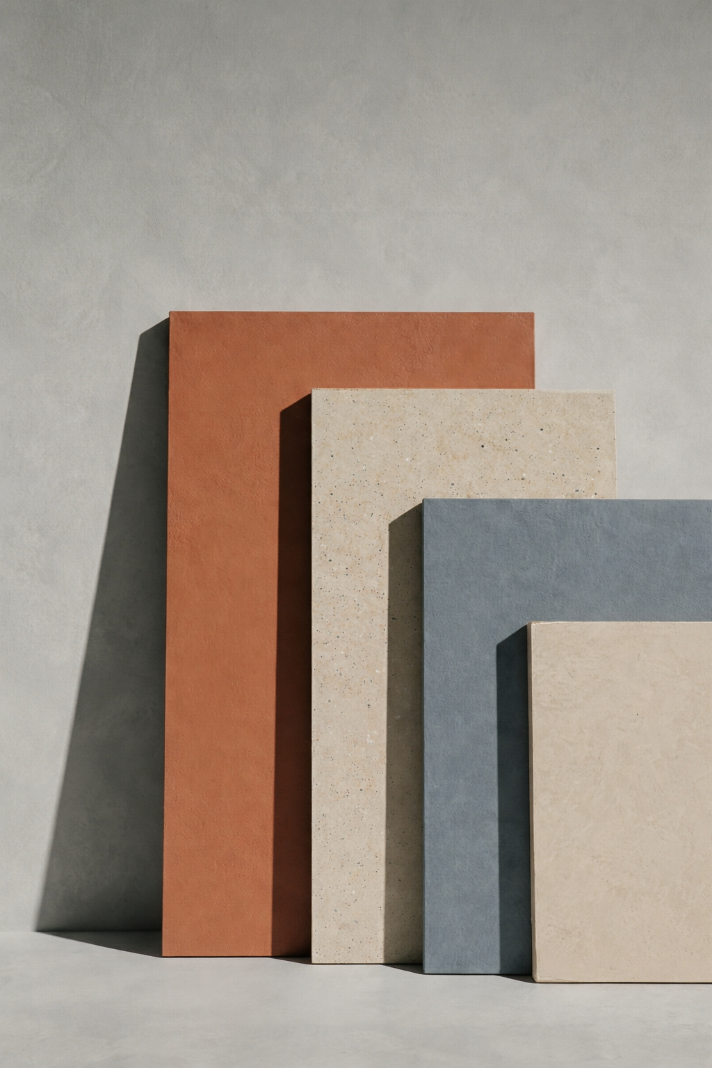
For example:
Feather — a soft, earthy neutral ideal for calm bathrooms
Moss — grounding and contemporary in kitchen spaces
Wolf — a balanced architectural grey for modern builds
Fossil — warm minimalism without the beige cliché
Salmon — muted warmth that softens hard lines
Used on walls and floors, these tones create cohesion — not contrast.
And because Forcrete is seamless, the colour flows through the entire space without visual breaks.
Irish interiors are evolving.
Homeowners want warmth without clutter.
Architects want material honesty.
Designers want colour that doesn’t overpower.
Moving beyond white and grey doesn’t mean abandoning simplicity.
It means choosing tone with intention.
Forcrete allows colour to feel like part of the architecture — not something added later.
And that’s where contemporary Irish interiors are heading.